
Colors That Calm: Harnessing Hues for a Peaceful Home
Serene Hues: Crafting Calm Spaces 🧘♀️
Humanity has long recognized the profound emotional power of color. From ancient rituals to modern design, hues shape our perceptions and moods. Early civilizations intuitively used specific shades for spiritual or calming purposes, understanding their deep influence on the human psyche. This innate connection is fundamental to modern color psychology.
The scientific exploration of color's impact began centuries ago. Thinkers observed how certain shades could soothe anxiety or invigorate the spirit. Early studies, though rudimentary, laid the groundwork for understanding physiological and psychological responses to different parts of the visible spectrum. This historical journey highlights a persistent human curiosity.
Prior research often focused on color's direct association with natural elements. The vastness of the sky and tranquility of oceans naturally linked blues with serenity. Greens, reminiscent of lush landscapes, became synonymous with renewal and peace. These deep-seated connections are more than cultural; they tap into our evolutionary heritage.
More recent investigations delve beyond mere association, exploring neurological responses and environmental psychology. The aim is to precisely quantify how color influences mood, productivity, and overall well-being within enclosed spaces. This evolution from anecdotal evidence to empirical data underscores the growing importance of informed color choices. Wicureo leverages these insights.
Insights from Color Psychology 🧠
- Studies consistently show cool colors like blues and greens effectively reduce stress, promoting calm and often correlating with lowered heart rates and blood pressure.
- Color's psychological effects aren't universal; cultural background and personal experiences can subtly modify individual emotional responses to specific hues.
- Beyond hue, saturation and brightness significantly modulate impact. Muted, desaturated tones generally evoke more tranquility than vibrant, intense versions of the same color.
Decoding the Palette for Peace 🎨
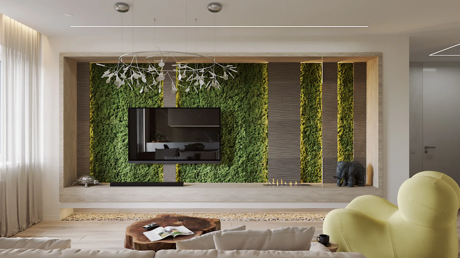
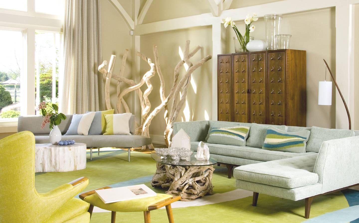
The pervasive calming effect of blues and greens stems from our primal connection to nature. An expansive sky or serene forest inherently evokes peace. This visual shorthand for safety makes these colors ideal for spaces dedicated to relaxation and mental restoration.
Crucially, different shades yield varied impacts. A deep, muted teal fosters introspection; a bright lime green might stimulate creativity. Tone, depth, and undertones significantly dictate emotional resonance, demanding careful selection.
Beyond cool colors, neutrals are vital. Soft grays, warm beiges, and gentle off-whites offer a soothing backdrop. They allow other elements to shine without overwhelming senses, creating a harmonious balance that enhances peace.
While cultural interpretations vary (white: purity vs. mourning), fundamental physiological responses to light and color, like relaxation from cooler wavelengths, often transcend these boundaries, suggesting a universal core effect.
Personal preference remains a powerful factor. What one finds soothing, another might perceive as bland. Considering individual tastes is essential, ensuring the chosen palette resonates personally for true comfort.
Applying these insights demands thought for room purpose and natural light. A north-facing room benefits from warmer undertones in its cool palette to avoid starkness. Wicureo meticulously crafts designs, tailoring schemes for optimal well-being.
Crafting Your Calm Environment ✨
- Strategic color selection transforms living environments into havens of peace, reducing stress and promoting mental clarity, directly enhancing home life quality.
- Understanding color psychology empowers informed design choices, creating spaces that actively support emotional and psychological needs, moving beyond mere aesthetics.
- Wicureo's approach integrates these principles, ensuring every hue contributes to a cohesive, calming atmosphere, fostering a sanctuary where tranquility thrives.


Leave Comment